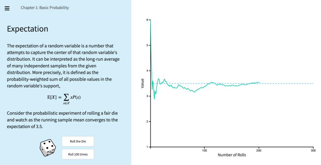
I stumbled on a remarkable data visualization from Brown University that expresses the fundamentals of probability more effectively than anything I’ve seen or engaged with previously. The interactive tool allows you to run single or batches of simulations (e.g. rolling dice, picking a random card, etc.) to illustrate chance, variance, regression to the mean, etc. It’s a simple yet powerful communication of the underlying concepts, and reinforces the value of visualizations.